You're on a scenic route through a state recreational area known as the human mind. You ask a pass-byer for directions, only to find he has no face or something. Suddenly up ahead, a door in the road.
Zwift Hardware Tutorial
UX/UI, Prototyping, User Testing, Animation
Brief
Zwift was in need of a tutorial template that could be used for their various hardware offerings. The tutorial would be a visual walk through of how to use the different devices while playing the game. Zwift also wanted a tutorial experience that could handle all of the hardware components they had planned to release with no additional development time once created.
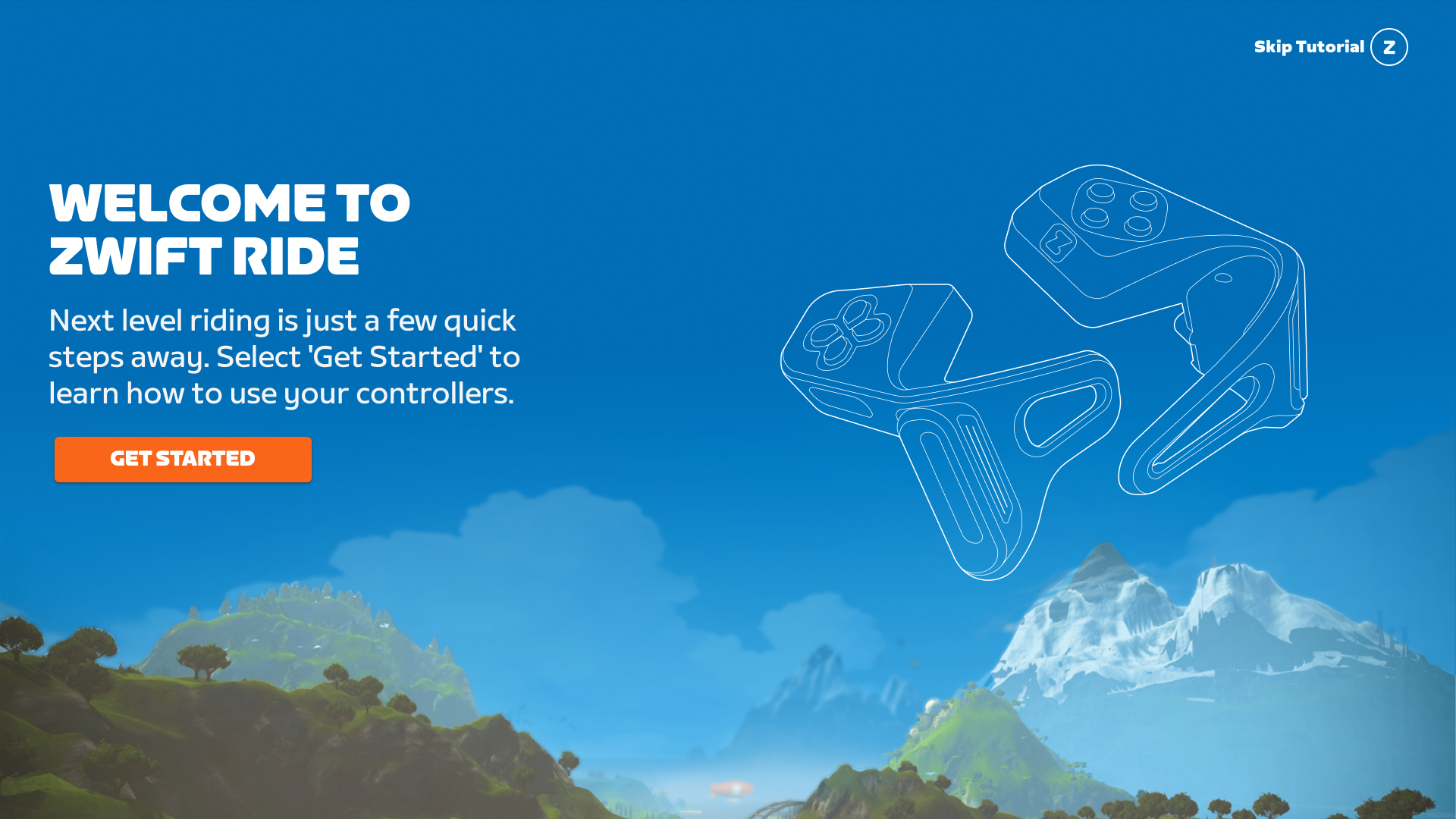
Opening screen of hardware tutorial.
The Strategy
Once the hardware team finalized hardware requirements and functionality we reviewed their documentation in order to start sequencing the tutorial based on the first hardware offering, the Zwift Play. The Zwift Play is a set of controllers that mount to the Zwifter’s handlebars. Once mounted, they are used to navigate the game and once they are riding helps utilize the in game controls and options. We focused on the core controller mechanics: the Cross pad (navigating), Z Buttons (selecting), Paddles (steering and braking), and L2 and R2 buttons (shifting).
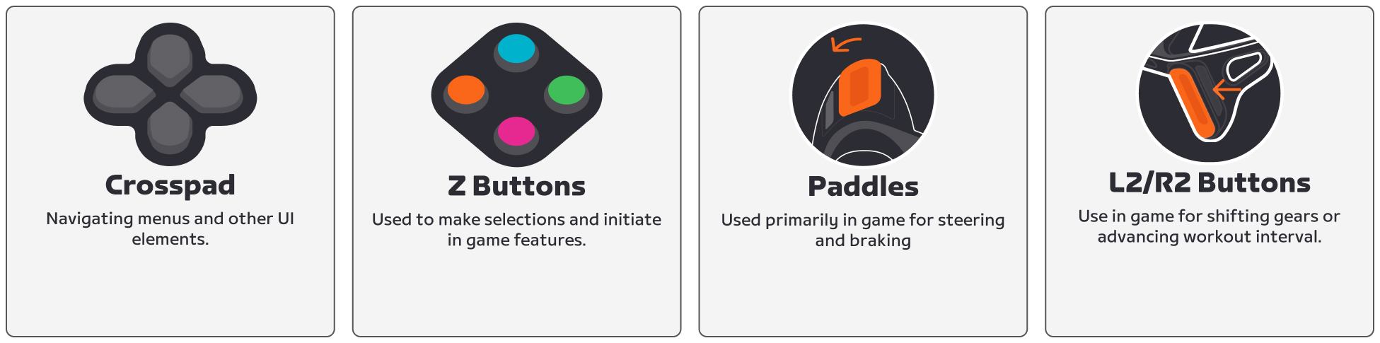
Zwift Play controller functionality that informed the sequencing of the tutorial.
Layout and color
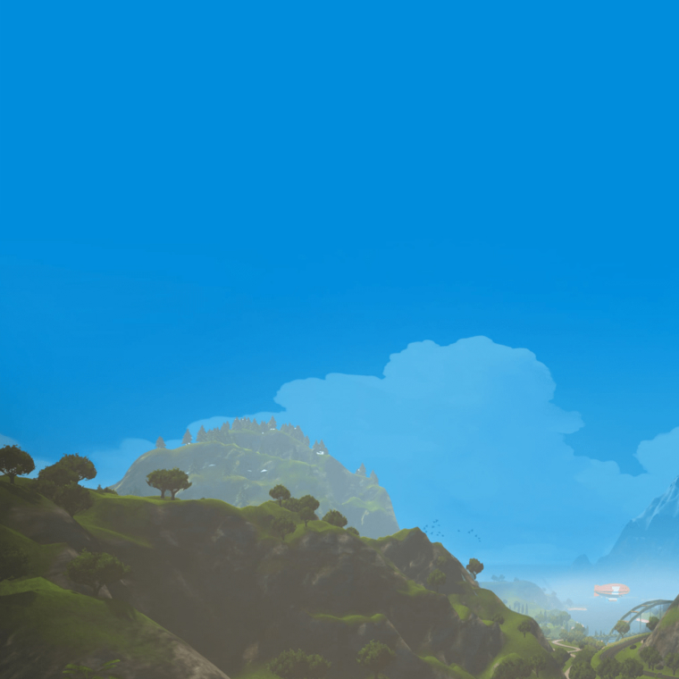
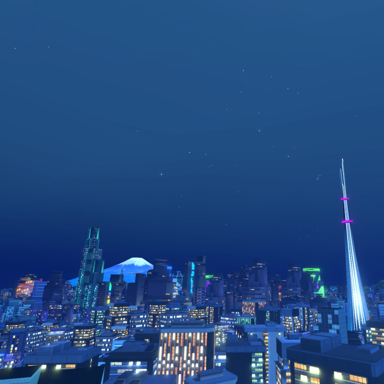
As we worked through the sequence of steps we started to design the layout of the tutorial. Since the tutorial needed to work across all devices we needed to create safe spaces for the content so that it would be visible and scale across the different viewports. Part of the safe space requirements was to consider the visual contrast of the content and the background with the goal of meeting WCAG AA requirements. Our solution was to utilize images of the world that we could curate and compose in away that allowed for a solid color background. We conducted a few tests with different blues until we hit the right contrast ratio that met WCAG AA. We ended up with what we referred to as Sky Blue. As long as our content area had solid Sky Blue behind it we would meet the requirement.
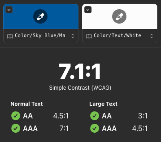
We started with Zwift Blue and reduce the colors chroma until we landed on a color that worked for all sizes of type.
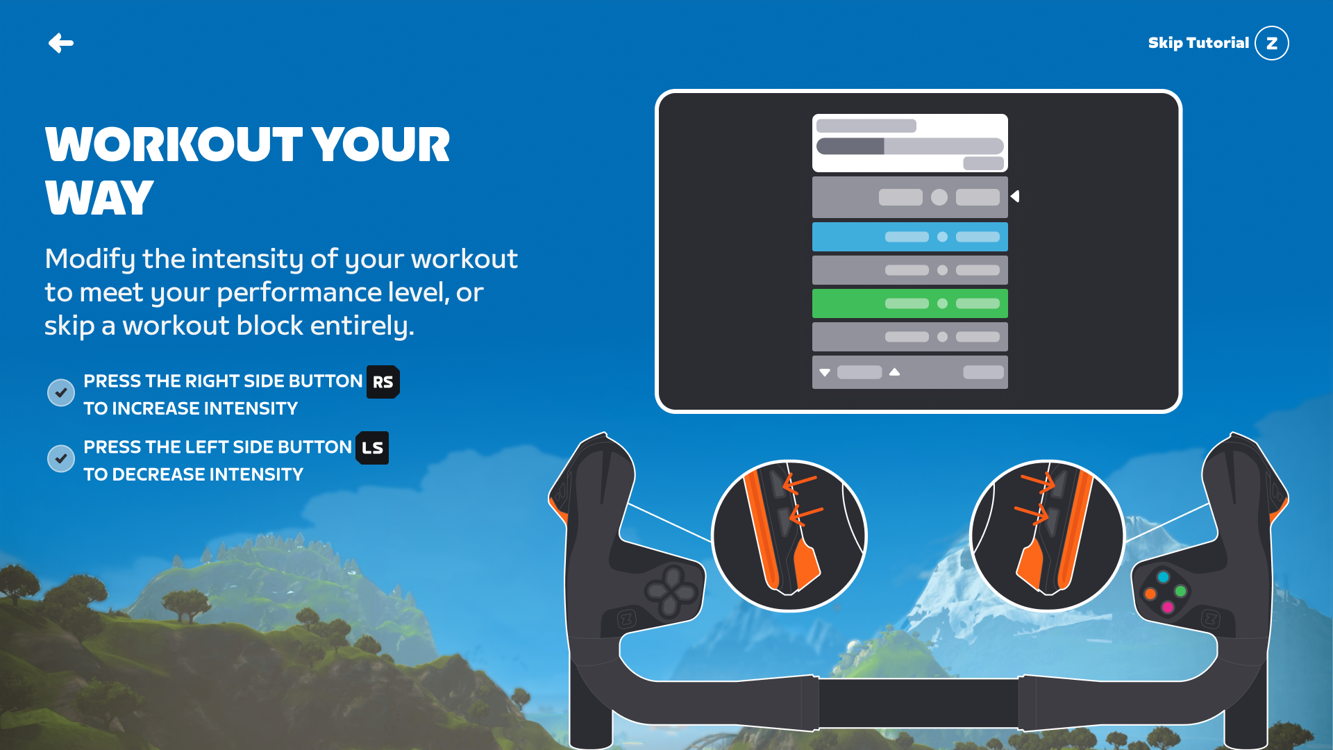
In the case of the Zwift Play tutorial, we wanted to use design elements that included the handlebars with the play controllers attached. We felt that this was a nice visual que that would help Zwifters identify the button locations. We decided to leave the lower third open free from content so that we can showcase the world with the bars overlaid on top. This would allow us to have a solid blue behind the slide content.
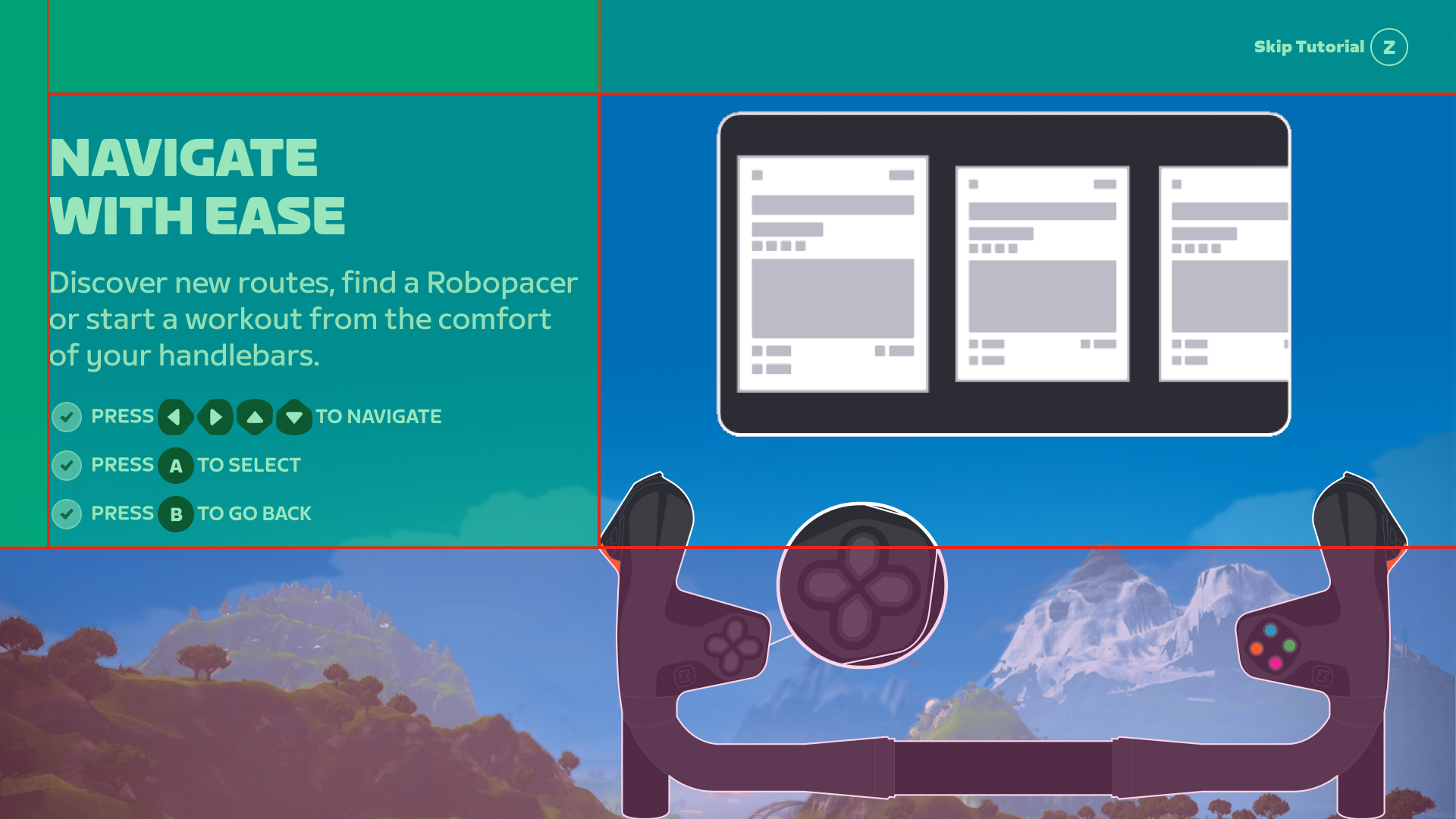
Safe spaces that we designed into the layout of the tutorial. From Left to Right: Main Content Section, Screen animation region, and lower third used for visuals and handlebars.
Animation
As the visual design explorations started to wrap up we began focusing on animation and its role in crafting the experience. We felt that we could define some motion principles as it relates to the manner in which elements enter and exit the frame or stage. The motion principles would be beneficial in communicating completion of steps and helps create a more dynamic space similar to actual game play. We decided on a more simplified look so that we would eliminate the need for localization and any potential changes to the UI.
An example of how elements should move on and off the stage.
Post Release
Once the design of the tutorial for the Play controllers was complete we started to document and formalize components for the Design System. We created templates in the Design System Figma file so that once the tutorial was live and in production we could publish the updates so that the entire Zwift design team had access to them and could use them to update the flow based on their project as well as use them for user tests. The tutorial was well received both by the community as well as internally, marking the first of the hardware offerings by Zwift.
Prototype used for testing user flow and content.
Tutorial screen showing handlbars with the Zwift Play controllers.
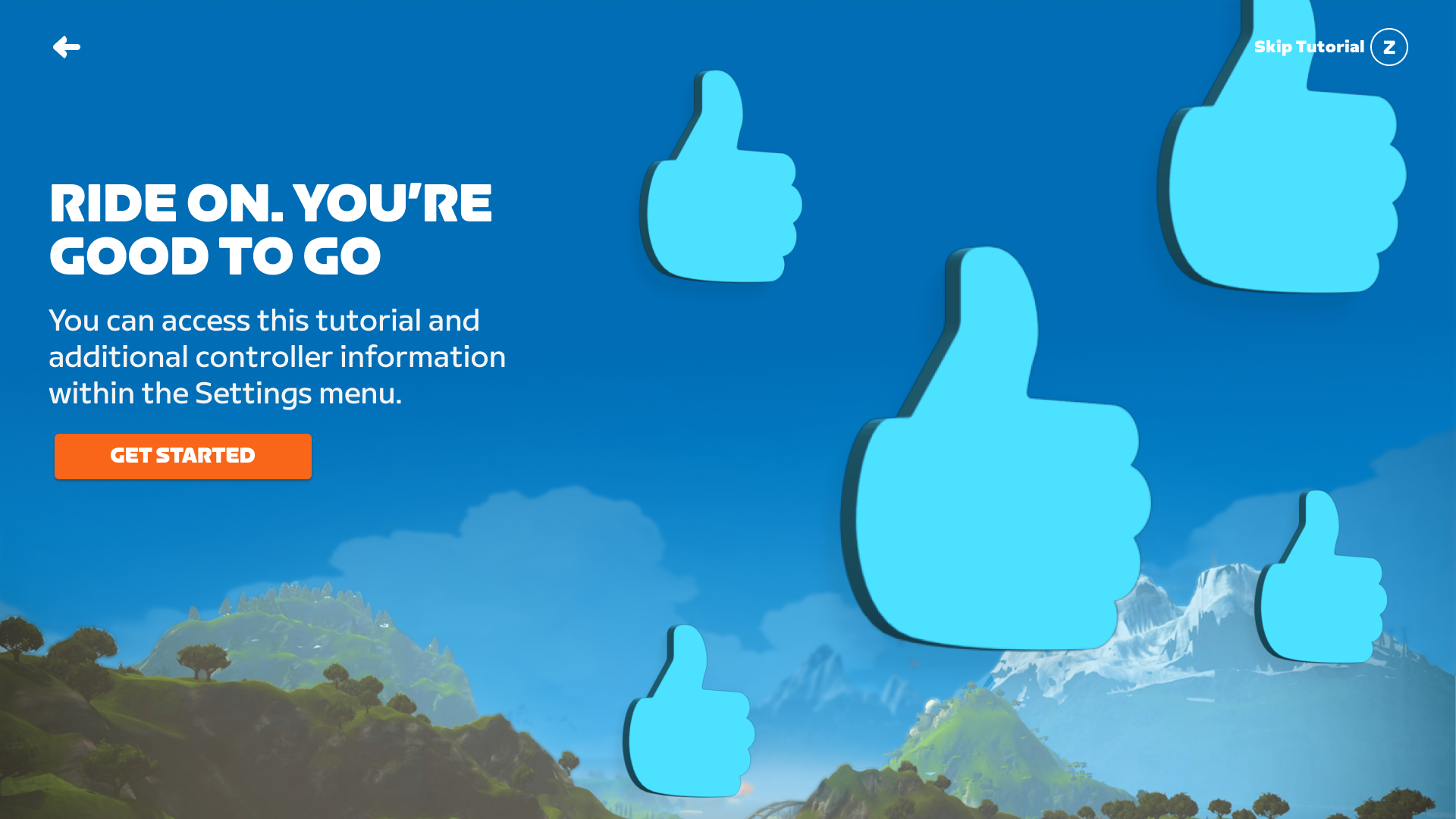
A Ride On bomb on final screen.