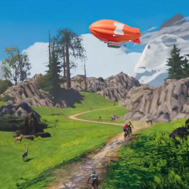
You're on a scenic route through a state recreational area known as the human mind. You ask a pass-byer for directions, only to find he has no face or something. Suddenly up ahead, a door in the road.
Zwift Memberships
UX Design, UI Design, Prototyping, User Testing
Brief
Zwift, a cycling simulator meets video game, was in need of improving their core revenue stream, Memberships. With popularity and curiosity on the rise they needed to reduce new member drop off, utlize their strong community to help drive growth and increase/promote year round ridership to reduce churn.
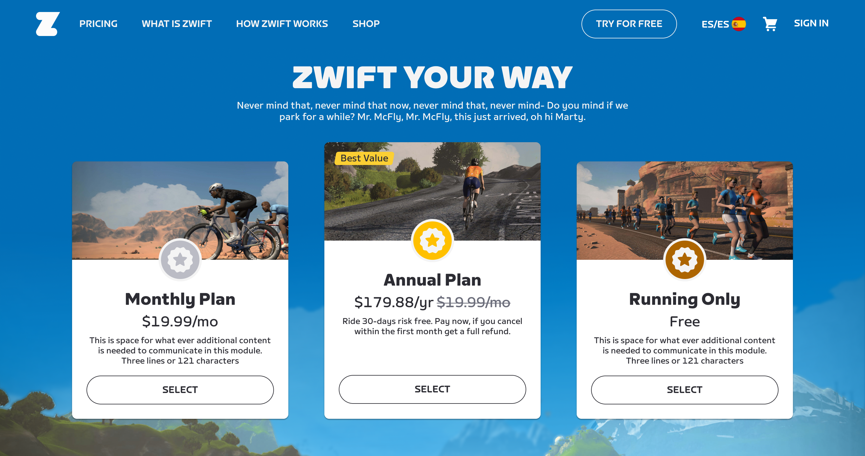
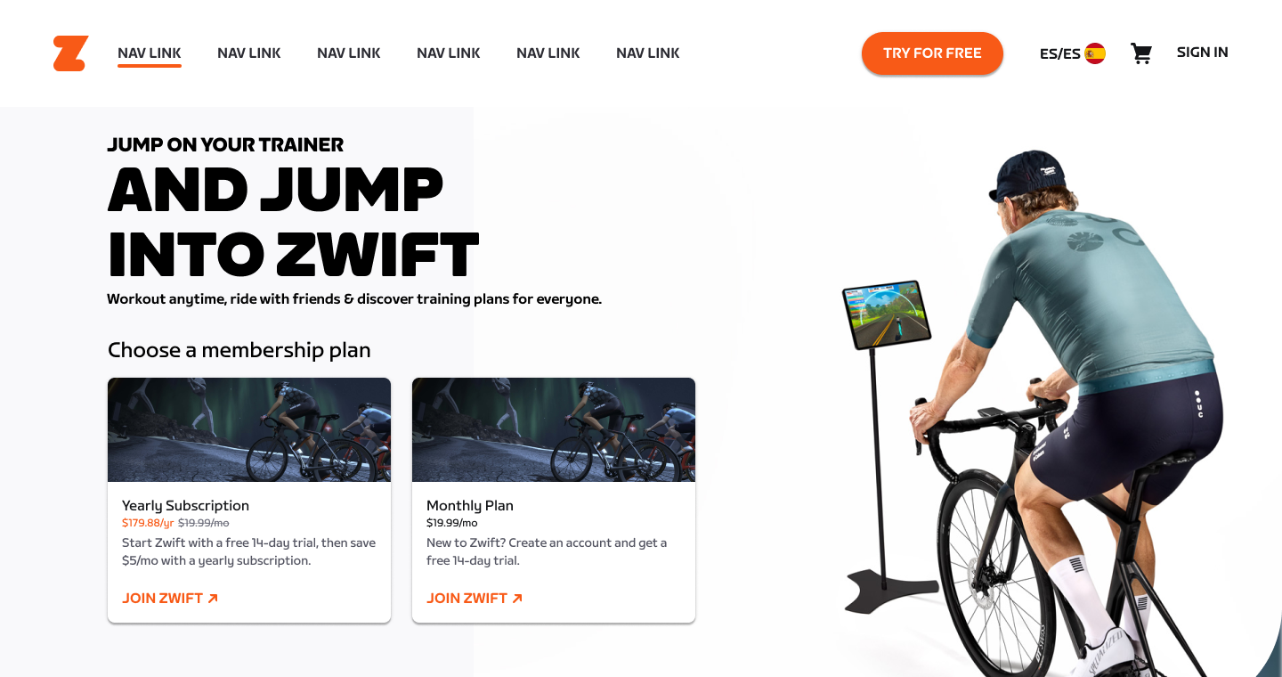
Hero section with membership options offered at launch.
The Strategy
As the project began to kick off the UX Research team shared out the Zwifter personas that they developed through research. We used the personas as a starting off point of how we might improve the current experience. After reviewing the personas and the current experience, we decided to take a multi step approach that is laid out below. Aside from updating the overall experience, we needed to address some tech updates that were needed in order to properly launch the features. The goal was to release a Yearly membership to encourage year round activity in order to combat seasonality, and utilize the large community by encouraging Zwifters to invite their friends to join in on the fun.
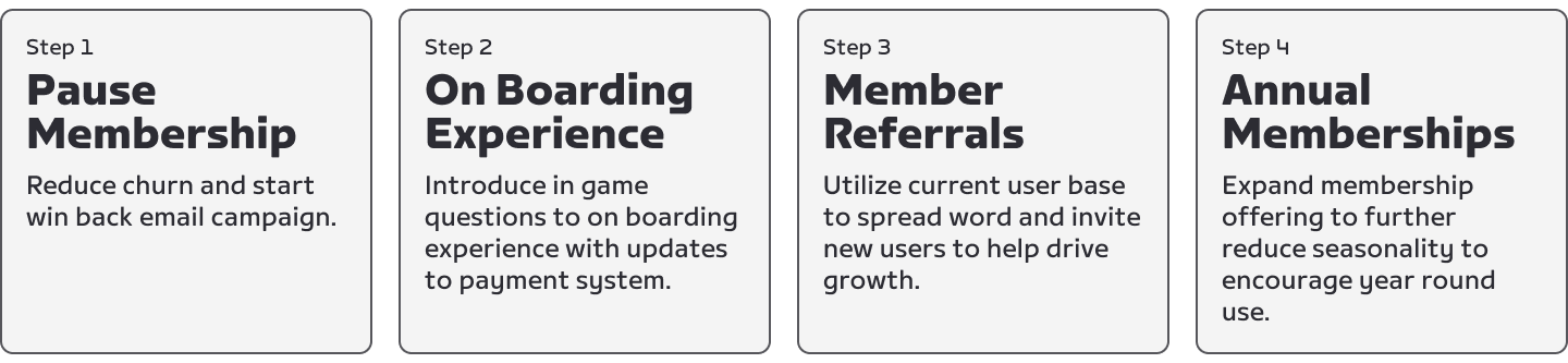
The different phases of the Membership project.
Design System and Design hand off Improvement
Although not a project requirement I took it upon myself to develop and utilize the Zwift Web Design System that I had been working on in my spare time. I had been creating the foundational elements and design principles that would be used to create the different components needed to launch the different features. We also used this opportunity to formalize a design to dev hand off so that we could properly communicate the requirements.
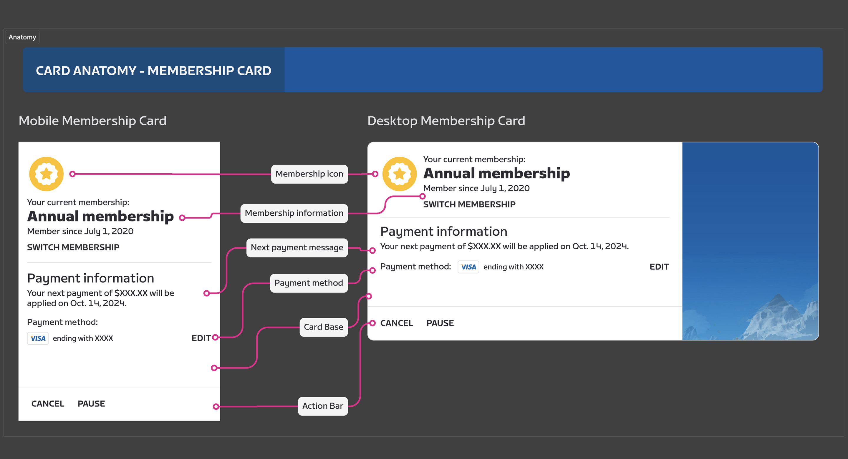
Documentation for membership card.
Phase 1: Pause Memberships
For the first phase of the project we wanted to give ourselves a quick win in that we could reduce seasonal churn while we started to rework some of the backend. From the design perspective this was a light lift which could be quickly. Requirements in hand we designed a simple form that would allow a Zwifter to select their pause duration and if they wanted some feedback as to why they are pausing. We wanted to make sure that we clearly communicated when their membership would pause and when it would resume in order to reduce confusion while in game. Initially we launched with a pause range of up to five months, which was based on data that we had collected prior to the pause feature launch. Once the Zwifter was paused we would start a win back campaign that was focused on convincing them to come back early by updating them on what has been happening while they have been gone, ways to improve their fitness indoors and racing. Once we launched the Pause feature we saw a significant drop in membership churn during the summer months in both hemispheres.
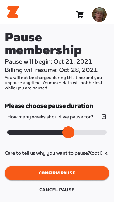
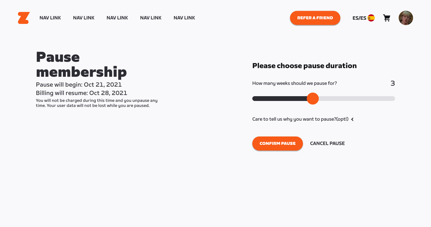
Zwift Members now have the option to pause their membership for the months that they are not riding indoors.
Micro Animations
As part of the Design System work that I started at the beginning of the project I wanted to create and establish guidelines for adding "moments of delight" to the UI in the form of micro animations. I felt that these small moments helped communicate the tone of the Zwift brand while simultaneously providing visual feedback when navigating the web experience. The goal was to establish and validate guidelines that could be applied to the global Design System and established as part of the Zwift design principles.
Change/update membership animation.
Phase 2: Onboarding Updates
Once phase one was launched we started on the work for Phase 2: Onboarding experience. Our top requirements for this phase was to add in-game questions and payment capture to the account creation process. We felt that these updates would streamline the on-boarding flow (web > game) and positively impact conversion to becoming a paying member. We started off by digging into the code to see what we could use from the in-game onboarding flow as it lived at that time. After reviewing we determined that we wanted to grab the data that would be needed to start the game so that a new Zwifter could load the game and start riding. With all of the criteria established we started mapping out the flow and then began visual explorations. Part of the work was to create a prototype to test and validate some of the language and sequencing we intended to use. Once in development we tested further and made tweaks until we felt what we had was ready for release. We also added some data tracking so that we could further tweak the flow as new Zwifters signed up.
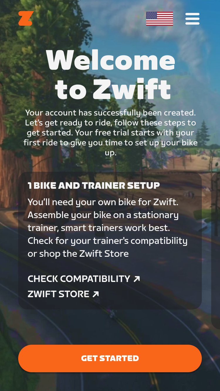
Zwift new members welcome screen on web.
Prototype used for user testing, reviews and eventually for documentation for dev handoff. Press R to restart.
Phase 3: Member Referrals
With two phases complete we now turned our sites to the vibrant and dedicated community. We wanted to encourage every Zwifter to tell their friends so that they could ride together, ride more and save a few bucks while doing it. Like other apps we decided on using a referral system, essentially a reward system for getting your friends to become members. In our case we would give out free months per converting subscriber. We wanted to design the system so that we could eventually include in-game items or other incentives. We created a quick mockup and prototype of the flow and made a few updates before handing it off to developers as they wrapped the previous phase. With all of the data trackers in place we launched the program and started to monitor the data as it came in. We soon found Zwifters sharing on instagram and reddit about the ability to refer friends and saw an immediate uptick in new members from referrals. The member referral program was considered a success resulting in new subscriber acquisition (+10% YoY, reversed declining trend), 3-month retention (+300 bps, reversed declining trend) and cancellations (reduced 12% YoY).
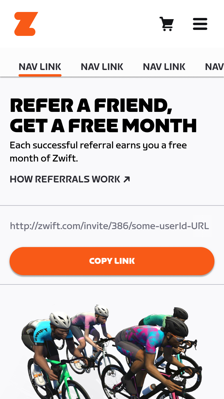
Zwift Referrals on mobile.
User testing prototype for Referrals program.
Source of Truth
For this project I started to develop a documentation process so that we could improve our communication with developers and stakeholders as well as create a source of truth for handoffs. Part of this was done by communicating with developers early on in the process so that we could understand the tech limitations so that we could consider ways to meet the requirements with the components that we had available. We wanted to work quickly but also reduce redundant components so that we could continue to scale through the different phases. Feel free to explore the documentation in Figma.
Zwift Referrals source of truth example.
Phase 4: Annual Memberships
For the final phase of the project we wanted to launch a yearly membership option to the account creation process. We felt that this would reduce seasonal churn and could be used to help promote the platform as a year round option for the cycling enthusiast. Since we had been building the backend for this phase the development work was a bit light but the design and testing would take a bit longer considering the importance of the language and the benefit of joining as a yearly member or switching from monthly to yearly, which we hoped would be a large majority of current members. We ran a few rounds of testing both in Figma and in development and finally landed on what would be the first role out of Yearly memberships. Shortly after launch we discovered that Annual memberships made up 10% of all new subscriptions sold, exceeding our projections (5% was the target) and we had 50K migrations of active subscribers in the first week after launch (exceeding the predicted 20k).
Zwift Annual Plans end to end on mobile.
User testing prototype for Members area updates.
Mid-fidelity prototype used to test out language used for Annual Membership.
Documentation for membership card.
Redeem Promotion module with animation.
Switching memberships animation on mobile.