You're on a scenic route through a state recreational area known as the human mind. You ask a pass-byer for directions, only to find he has no face or something. Suddenly up ahead, a door in the road.
Zwift Design System
UX, UI, Design Systems, Documentation
Brief
Zwift was in need of a design system that could support a native app, video game and web app. Their design system needs to act as a source of truth for the design and dev teams that support the three experiences. The Zwift design system also needed to reflect the brand voice and visual style so that they can create a seamless experience from when Zwifters are off the saddle to when they are on the saddle, all while meeting WCAG and other accessibility standards.
Title page of Zwift Design System presentaiton found below.
The Strategy
Like many organizations the Zwift design team had a collection of files that have been used to design features that are then vaguely translated across three dev environments, consisting of a web, a native app (iOS and Android) and a game experience.
Zwift has three experiences that span across different platforms that included a desktop and mobile experience.
We needed to assess what we had to work with and where we might want to start from scratch. After a lengthy UI audit we had a clear vision of what we had and what we needed to work on. We decided that what we needed was to establish design principles that would unify our visual language so that we can improve consistency across the user experience, and develop a process that enabled clear communication across all parts of the organization to improve efficiency and foster collaboration.
Design Principles
In order to build a solid house, we started with the foundational principles that would help define both the visual language and the structure of the design system. Working with the defined brand guidelines developed by the Creative team we set out to define our design principles as they relate to the brand language and company mission. These principles along with brand guidelines would be used to define shape typography, color, spacing and motion. These key elements alone would be identifiable as Zwift and together they create the Zwift experience.
Documentation
Although not a project requirement I took it upon myself to develop and utilize the Zwift Web Design System that I had been working on in my spare time. I had been creating the foundational elements and design principles that would be used to create the different components needed to launch the different features. We also used this opportunity to formalize a design to dev hand off so that we could properly communicate the requirements.
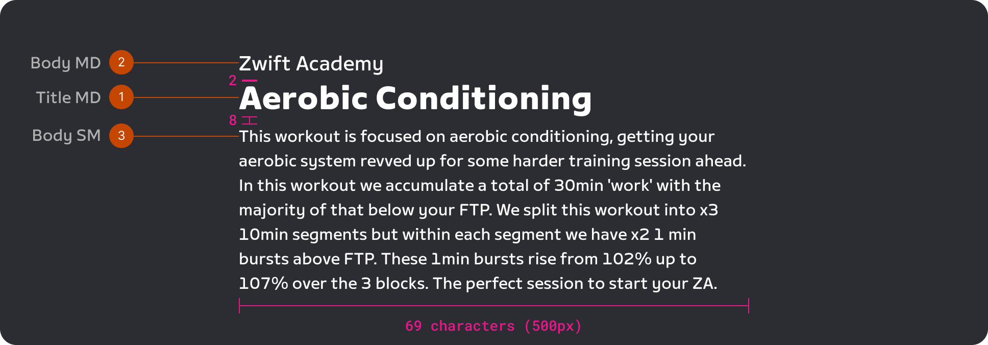
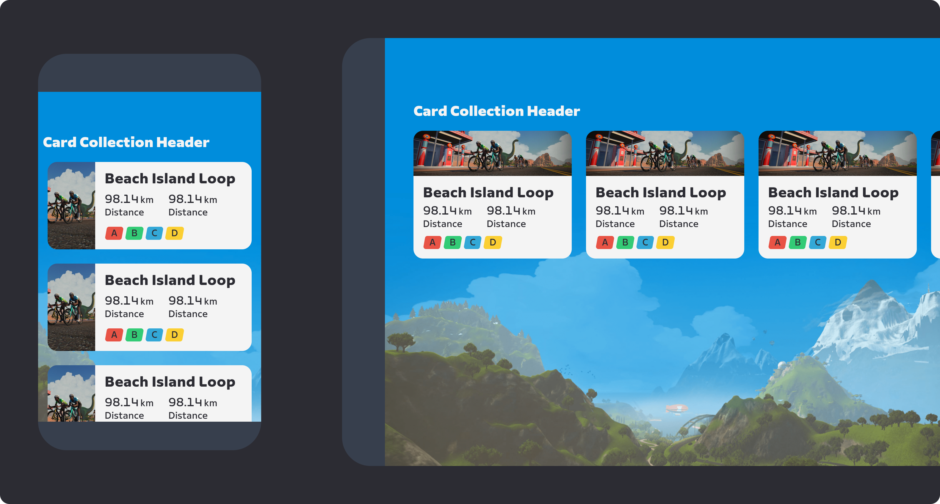
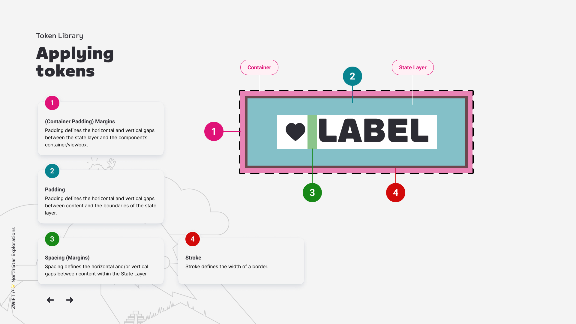
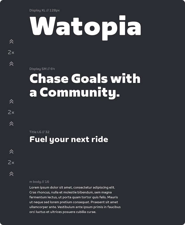
Documentation example of how to apply type and spacing tokens to an component.
Design Tokens
Upon starting the project we found that the different teams had different style libraries which were in different states of completion. As part of the design audit we collected the different styles in order to determine what needed to be updated and how they are represented in the different codebases. Understanding how the styles existed informed the token naming and structure. We wanted to create a single token library that aligned with Brand, met WCAG visual contrast standards and could be used by the different teams across the org. We decided to structure the library in a similar fashion to how it would be implemented in a dev environment, in our case specifically for the Game Client.
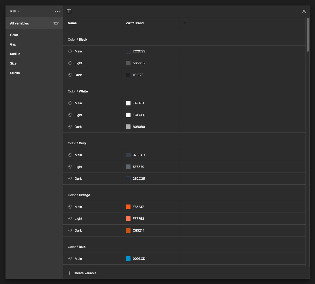
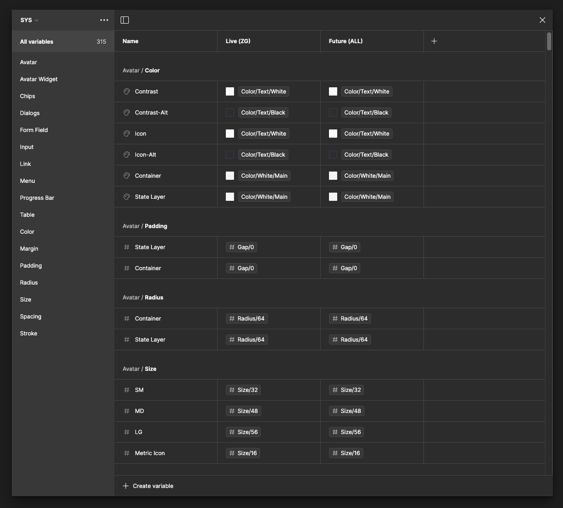
Design tokens in the form of Figma variables.
The Game Client could utilize a token structure that uses a Reference or REF library that contains all the raw values for spacing, color, radius, etc. These values would then drive the System or SYS libraries. These libraries would be specific to the different platforms that needed to be designed for, in our case Web, Native app and the Game Client. This structure allowed for optimal scalability as the need for different environments and teams might be necessary in the future. Aside from the scaling benefits we also used this time to unify the visual experience so that it met Brand goals and more importantly improved accessibility for all Zwifters.
Documentation example of how to apply type and spacing tokens to an component.
With our token library mapped out we started to share it out with the different teams so that we can grow interest and adoption of the new structure. It was at this time we started to gather feedback from both designers and developers on the organizational structure and naming semantics. That feedback was later assessed and updated accordingly. Now that we are all speaking the same language we hoped that the tokens would improve our design to dev handoffs and would allow us to utilize the built in features in Figma so that documentation would live alongside the visual example. Eventually this would also allow designers to experiment directly in the game client for prototyping or creating user tests. The design tokens library was to become an invaluable asset to the design process as well as to the overall adoption of the design system.
WCAG AA
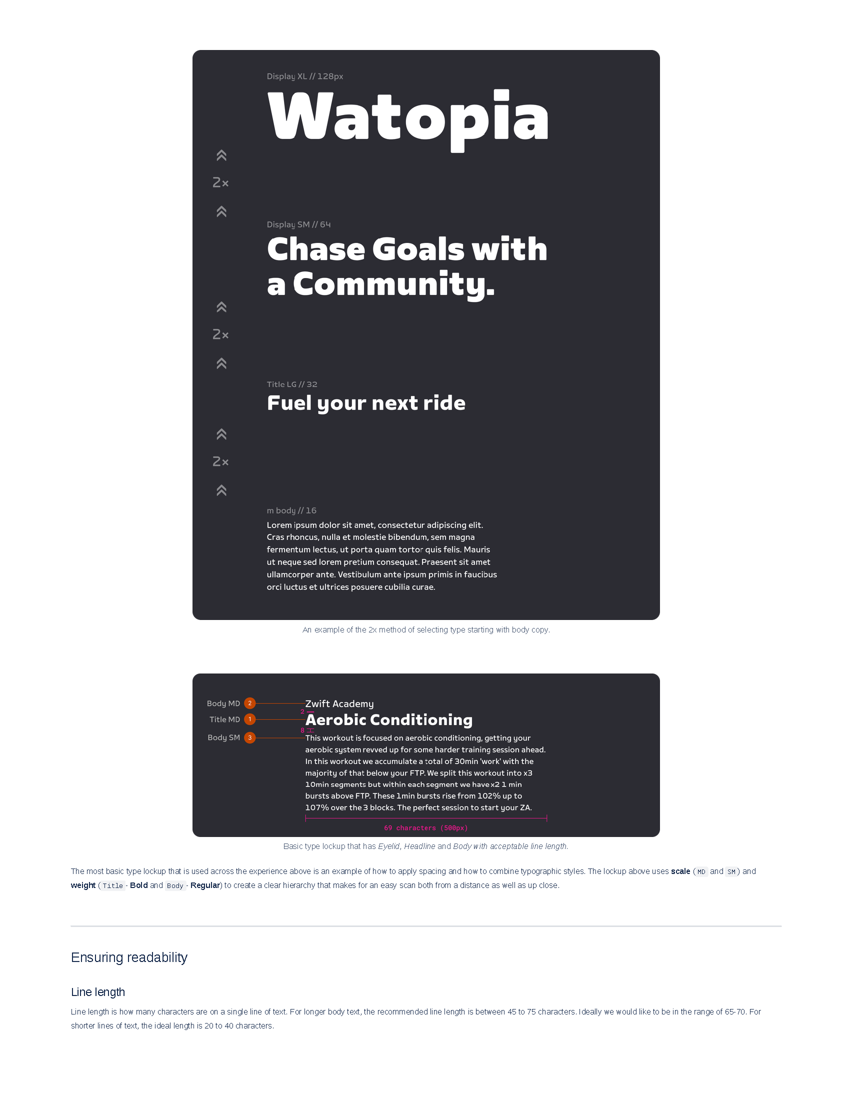
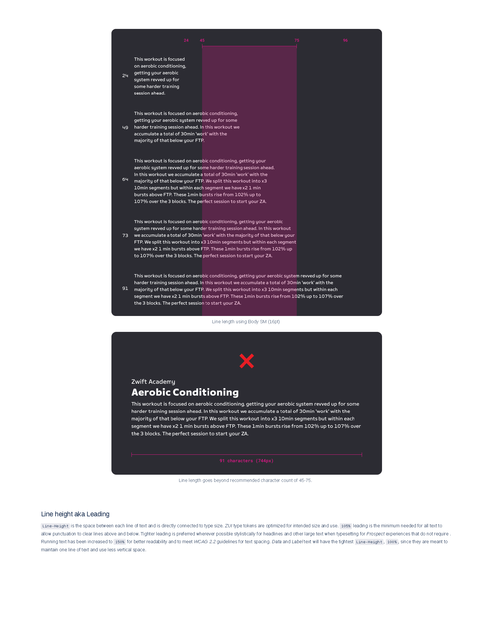
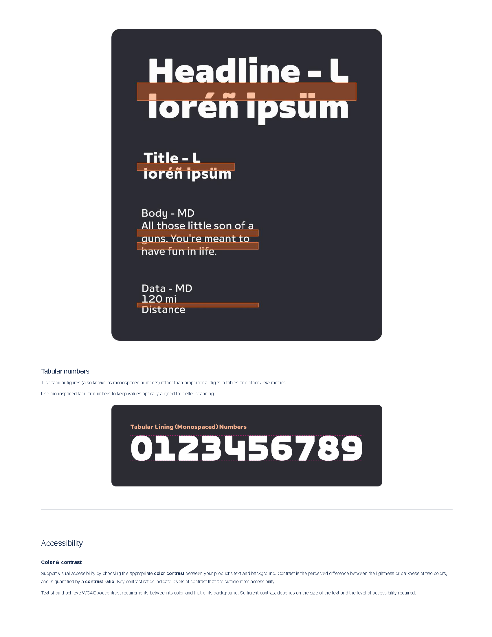
The Design system team made it a point to improve accessibility across the experience so that we could at a minimum meet WCAG AA standards. We wanted to make sure that we at a minimum met type and color contrast ratios to start. Typography and color are fundamental aspects of the experience. We wanted to make sure that all the typographic content was legible at every distance, near or far. Depending on the Zwifters set up they might have to sit far from their screen or sit close to a small screen. This meant that we needed a well defined type scale, utilized a more open line height setting, and increased the letter spacing so that nothing is jumbled on your 4k tv or your iphone.
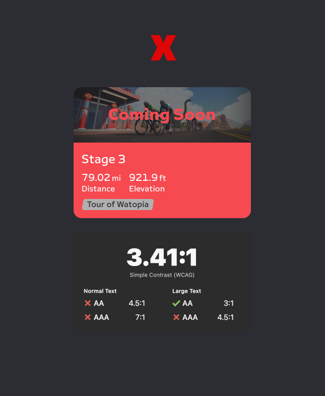
Examples of how we incorperated WCAG Standards into the design system tokens.
Motion
Although Zwift already had basic motion patterns, they lacked the consistency that makes for a more cohesive experience. Our goal was to unify motion patterns based on platform standards but rooted in the same foundational principles. We wanted to make sure that we maintained the liveliness of the brand but at the same time not make it the forefront of the experience. With that in mind we conducted a quick audit to see where we could improve and started to define our baseline standards so that we could begin to address the issues across the different experiences.
Above animated examples used for documentation.
Localization
We also wanted to implement the process of using Text Variables in our design components from a SYS level. We felt that this would improve the design and testing process by allowing us to test in different regions, as well as gut check designs for localized content. An added benefit is that this allowed us to utilize the localized content that we used in the game which meant that we didn't have any additional work for creating user testing flows that are close to what we see in the game today.
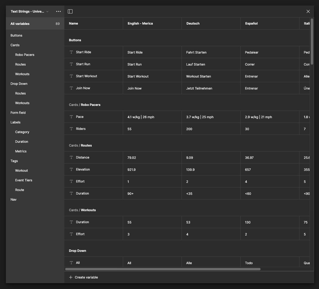
Text Variables used for components. We used the translated content used in game to prepopulate components with content but can be added to or changed at any time.
Sharing and Evangelizing
By far the most important task was to share updates of our progress so that we could gain support as well as validate some of our decisions based on what existed currently. We wanted to make sure that developers had a chance to give us feedback since some of the effort would require their assistance. This collaboration would then be used as a way to gain support from the PM’s and others. We needed to show all levels of the org the value of the design system and how it would open up the possibilities of how we design and develop the Zwift experience.
Above is the prototype used for presentations evanglizing the use of a design system.
Confluence documentation example of how to apply type and spacing tokens to an component.