You're on a scenic route through a state recreational area known as the human mind. You ask a pass-byer for directions, only to find he has no face or something. Suddenly up ahead, a door in the road.
ZwiftCap:
Your year in Zwift
UX/UI, Prototype, Hackathon, Marketing
Brief
Zwift hosted an internal hackathon that gave participating teams three days to create a blue sky project, of their choice, and present their final results to the company after the final day.
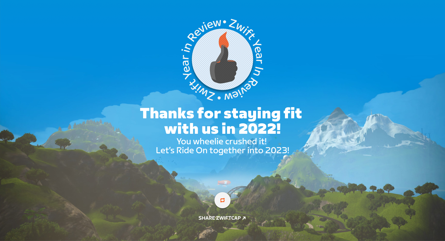
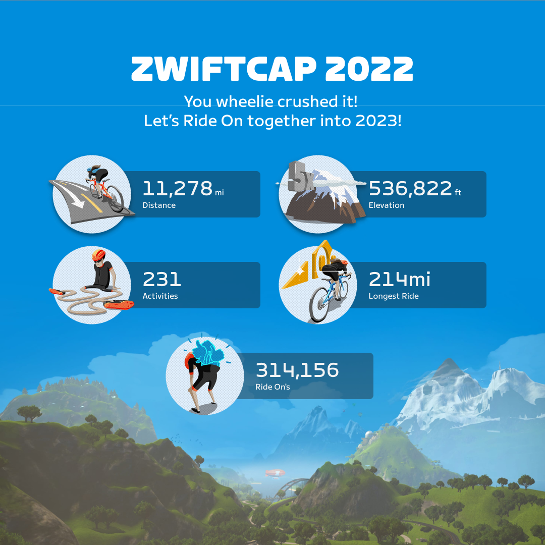
Final screen of the 2022 ZwiftCap.
The Strategy
Once assembled, the Year in Zwift team started by creating some requirements for the project so that we could focus on creating the best product in the time allotted. We gathered our individual ideas, UX research gathered on Zwifters and some inspiration in the form of other yearly recaps. We also considered that most Zwifters are also members of Strava, which will also be sending out a year in review, so we wanted to create something that was a bit more specific to Zwift and not so much about cycling. Once we finished our review we landed on three top level goals:
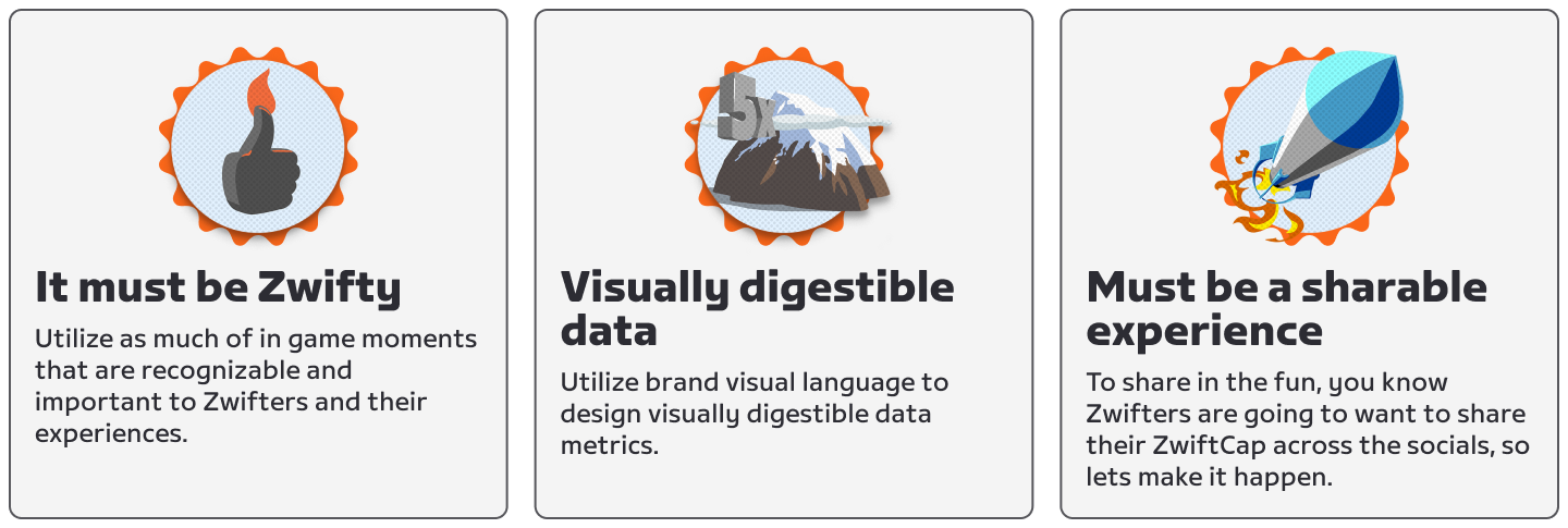
It Must Be Zwifty
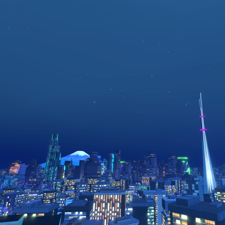
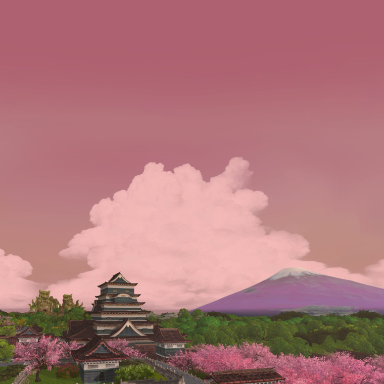
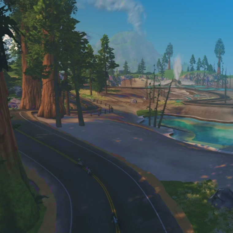
We wanted the Zwift world to be the focus of the visual language for the ZwiftCap. It's rare that we see the world of Watopia outside of the game, so we thought that this would be an excellent chance to do so. We could utilize a camera in game and stream it live or record and loop a video to give the impression that it's live footage. I felt that this would allow non members to see what they are missing out on and possibly lead to new members. Once you are reviewing your stats we switch over to the background that Zwifters see when in the climb portal. The climb portal background is not as busy as the world and would give the data more focus and allow it to showcase the achievements.
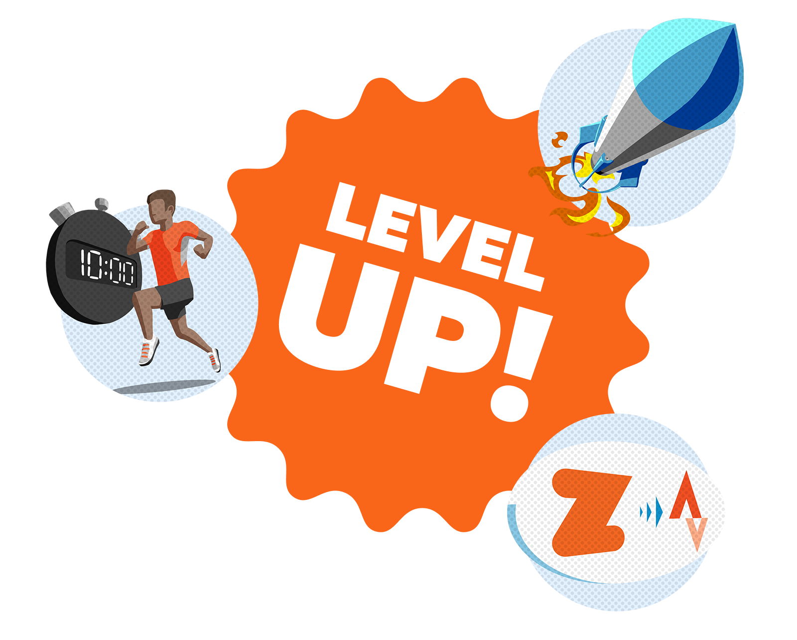
Zwift badges are a visual component that are used to communicate milestones of your Zwift experience.
Prototype used as source of truth for motion and cadence. Press R to restart.
In order to keep the design and development efforts light I utilized the Design System for Web that I had been developing along side the web dev team. I wanted to utilize the available components and if needed I could create some new components that if needed could be added to the system. The final piece of the visual language was adding some moments of delight in the way of animations. These animations could help set the tone as well as provide some assistance while navigating. We wanted to keep them lively with some bounce that could be found in the game. Our design decisions helped shape the look and feel of the ZwiftCap while still keeping it within the brand voice.
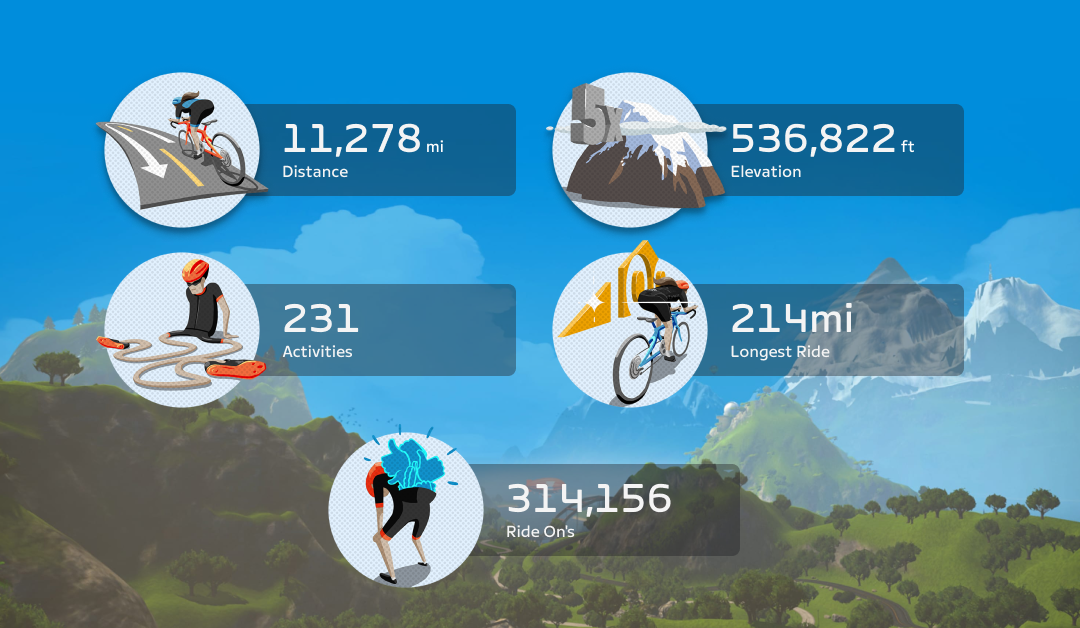
The Data and visualizations
As the team investigated how we would grab the data to populate the ZwiftCap, I started to work on the methodology for displaying data. We decided to not focus as much on the raw data but pick out the notable moments that happened throughout the year as it related to events, challenges and personal achievements like in-game unlocks, pr’s and the like. This would allow us to utilize all of the in-game assets and data since we would be able to grab directly from the game server and all of the components available on the web stack. I then started creating a prototype that would be used as a guide for how we want the front end to look and the type of motion that we wanted to use.
Sharing is caring
For our shareability goal, we wanted to carry over the visuals used in the interactive version of the ZwiftCap so that we maintain a throughline through the experience. This allowed us to utilize all of the components created, which could eventually be used on other projects related to recaps or streaks. From the tech standpoint we wanted to utilize native sharing capabilities so that no matter what device they are using they will be able to share to their favorite social networks.
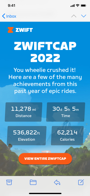
ZwiftCap announcement email.
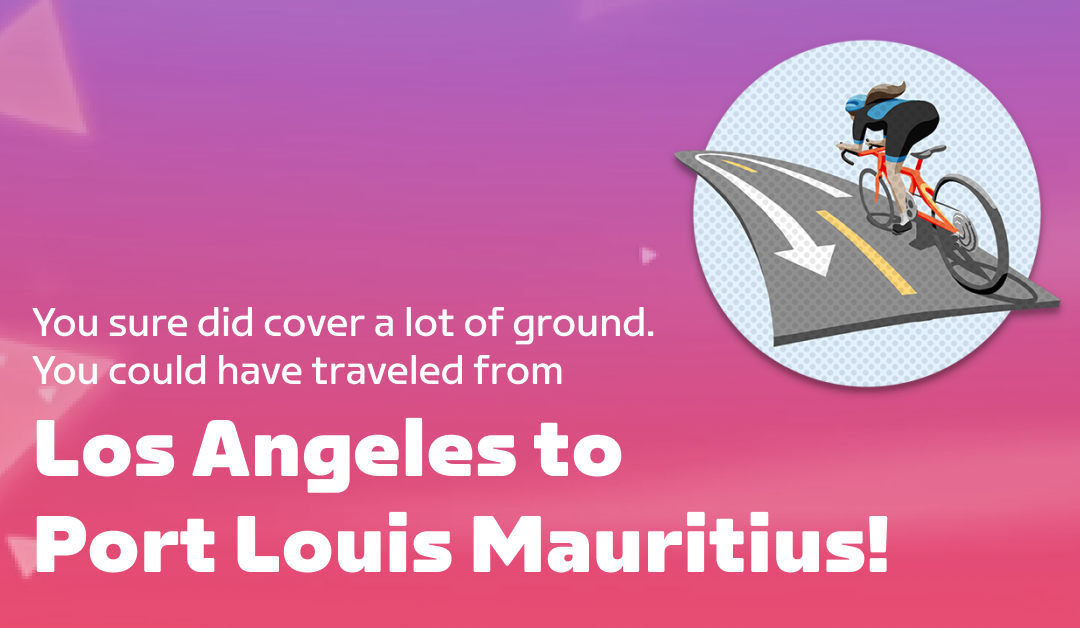
Social share image, in this case an instagram post.