You're on a scenic route through a state recreational area known as the human mind. You ask a pass-byer for directions, only to find he has no face or something. Suddenly up ahead, a door in the road.
Zwift Referrals
UX/UI, Prototyping
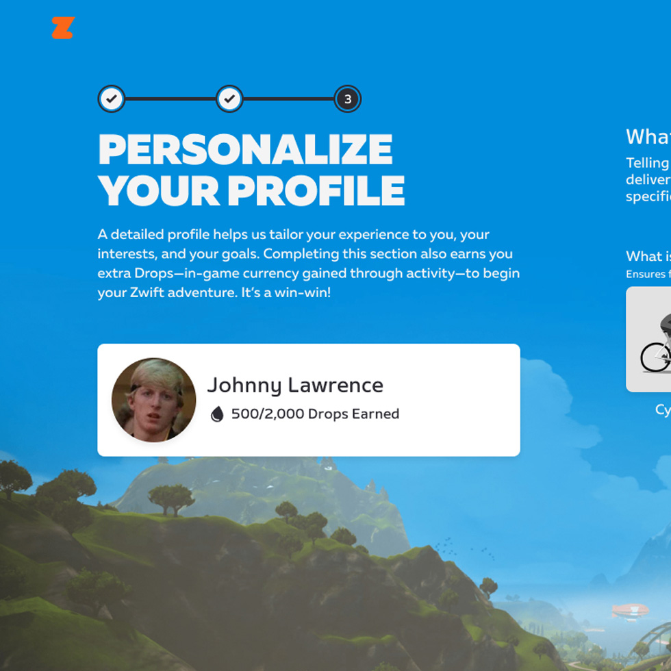
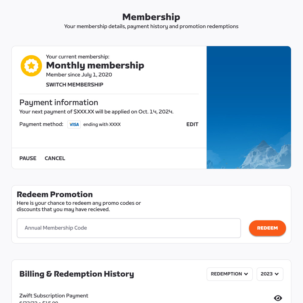
Like other subscription based services Zwift wanted to start a referrals program to improve subscriber growth. We felt that by utilize Zwift’s most vital asset, it’s large and dedicated community, we might be able to convert more apprehensive prospect into Zwift members. Who better to help promote the benefits of Zwift than those that are actively using it, now all we need to do is incentivize referring new Zwifters, in this case one free month of Zwift.
While the PM established financial perimeters with other stakeholders, we started off by mapping out the end to end process for referring a friend. Since we needed to consider how this might be impacted by payment gateways and membership entitlements we decided to meet with the developers early on in the design process so that we could better understand the tech driving the functionality of the feature and how that might inform some of our design decisions. This proved to be a valuable step in the process since it not only informed the design but also prepared us for the edgecases and design deliverables needed for a smooth handoff.
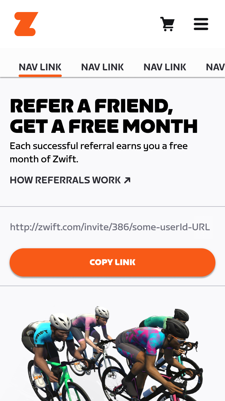
Zwift Referrals on mobile.
Zwift Referrals end to end preposal for dev. Zooming out might be required ¯\_(ツ)_/¯
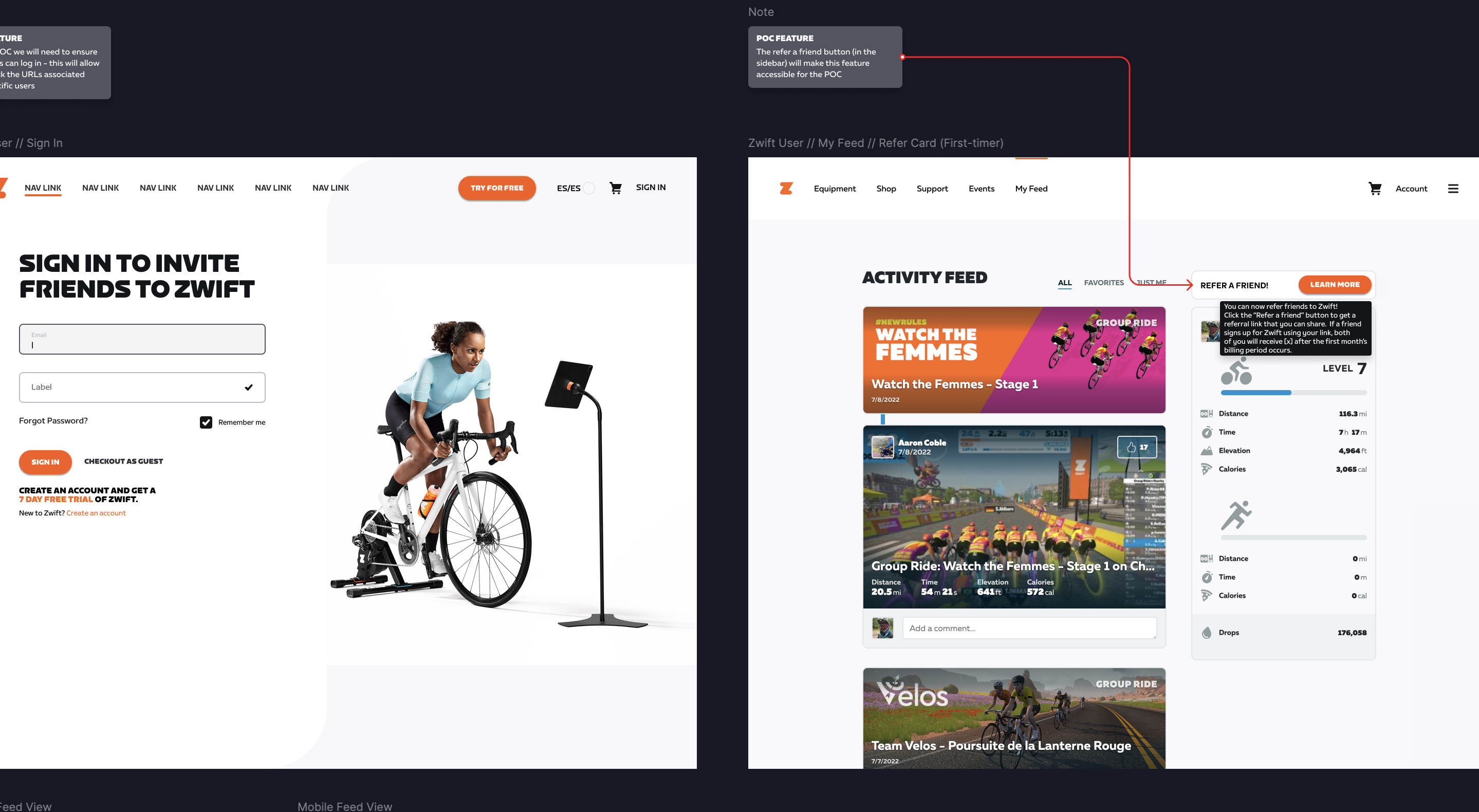
Referrals dev presentation.
Once the acceptance criteria had been defined we collaborated with the team UX researcher to develop a testing plan that would use the Figma prototype below. We wanted to make sure the the end to end flow didnt present any obstacles for completion as well as establish a few design patterns that could be utilized in future projects. After reviewing the test results we determined what functionality we wanted for launch and finalized the design exploration.
User testing prototype for Referrals program.
The Referrals project gave us the opportunity to build out an on boarding system for the web experience. Since there was nothing in place we started with some foundational prinicples for tooltip movement and placement. We then documented the guidelines for on boarding tooltip usage so that it could added to design system documentation that lived in conflunce.
Once the design was locked for v1, we started the documentation process for dev handoff. We took this opportunity to introduce a new way of documenting the design work with all of its details in one place, as seen below. Since we reviewed all of the different use cases early on in the project the documentation was based on our findings and just needed slight adjustments based on updates. We mapped everything to dev Jira tickets so that we are all looking at the correct design. This addition to the design dev hand off was a first for Zwift and became a welcome addition to future projects.
The member referral program was considered a success resulting in new subscriber acquisition (+10% YoY, reversed declining trend), 3-month retention (+300 bps, reversed declining trend) and cancellations (reduced 12% YoY).
Referrals first time on-boarding on mobile.
Zwift Referrals documentation for dev. Zooming out might be required ¯\_(ツ)_/¯
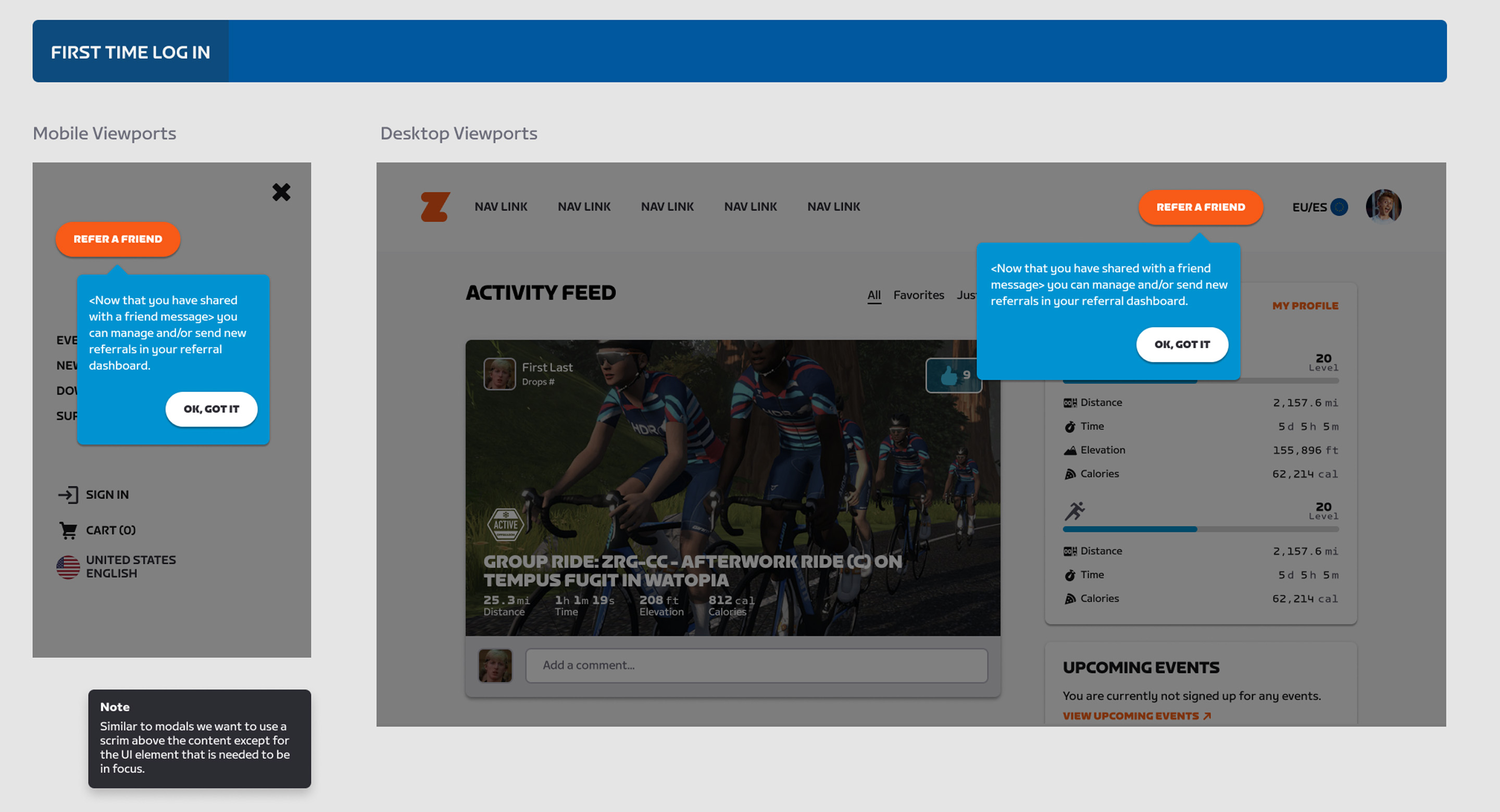
Referrals first time on-boarding on desktop.