You're on a scenic route through a state recreational area known as the human mind. You ask a pass-byer for directions, only to find he has no face or something. Suddenly up ahead, a door in the road.
Zwift Events
UX/UI, Prototyping, Web Design
Zwift Events are one of the most important features of the entire experience. It's the reason people join Zwift and why they become lasting members. Over the years the complexity of Zwift Events has required a bit of rework on the back end but little was done to update the front end experience. Considering all of the different event configurations that have been added over the years Zwift needed to improve the way Zwifter's can find and schedule events before they hop on a bike.
Above is the prototype used for review and documentation. You can click through the prototype and at any point hit R to start over. No account is needed.
As we started to review the current Event page we started to document our findings so that we could determine what was needed to improve finding and joining an event off the saddle. We had a chat with the team that built the event creator, the dev's involved and came up with a short list of event types, requirements, durations, etc. Once we had that list we conducted a quick card sort to determine the priority of said filter options so that we could create our first updated filter menu.
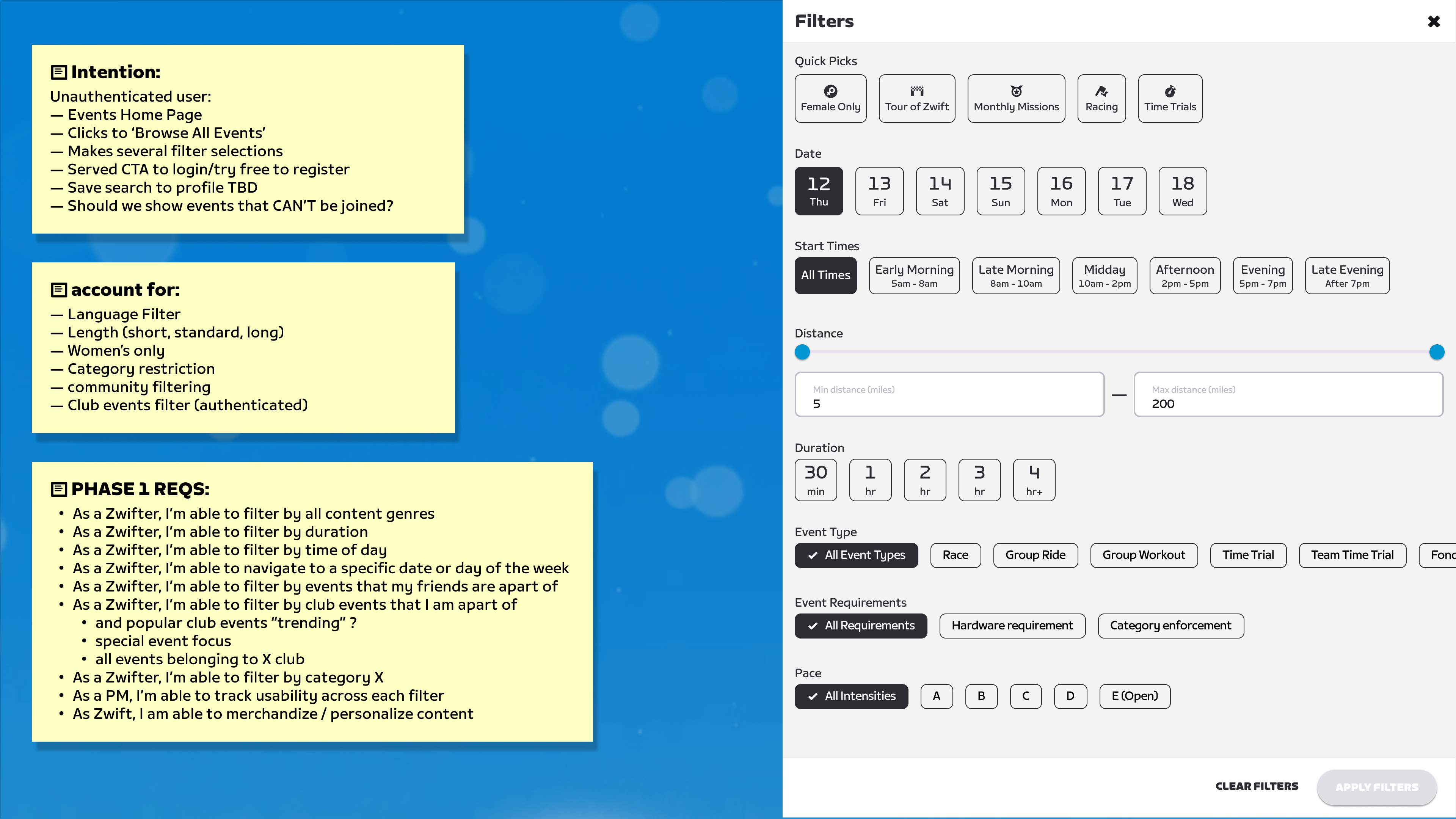
Documentation of process, requirements for events filter system.
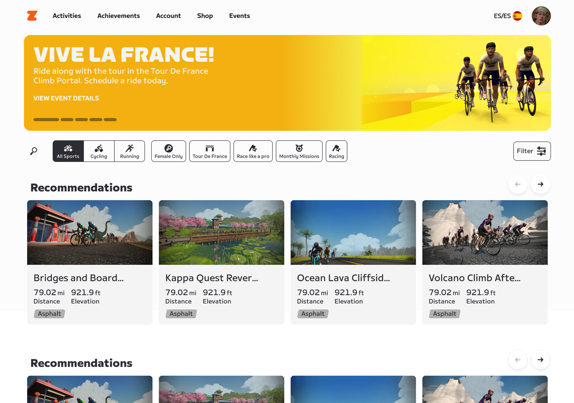
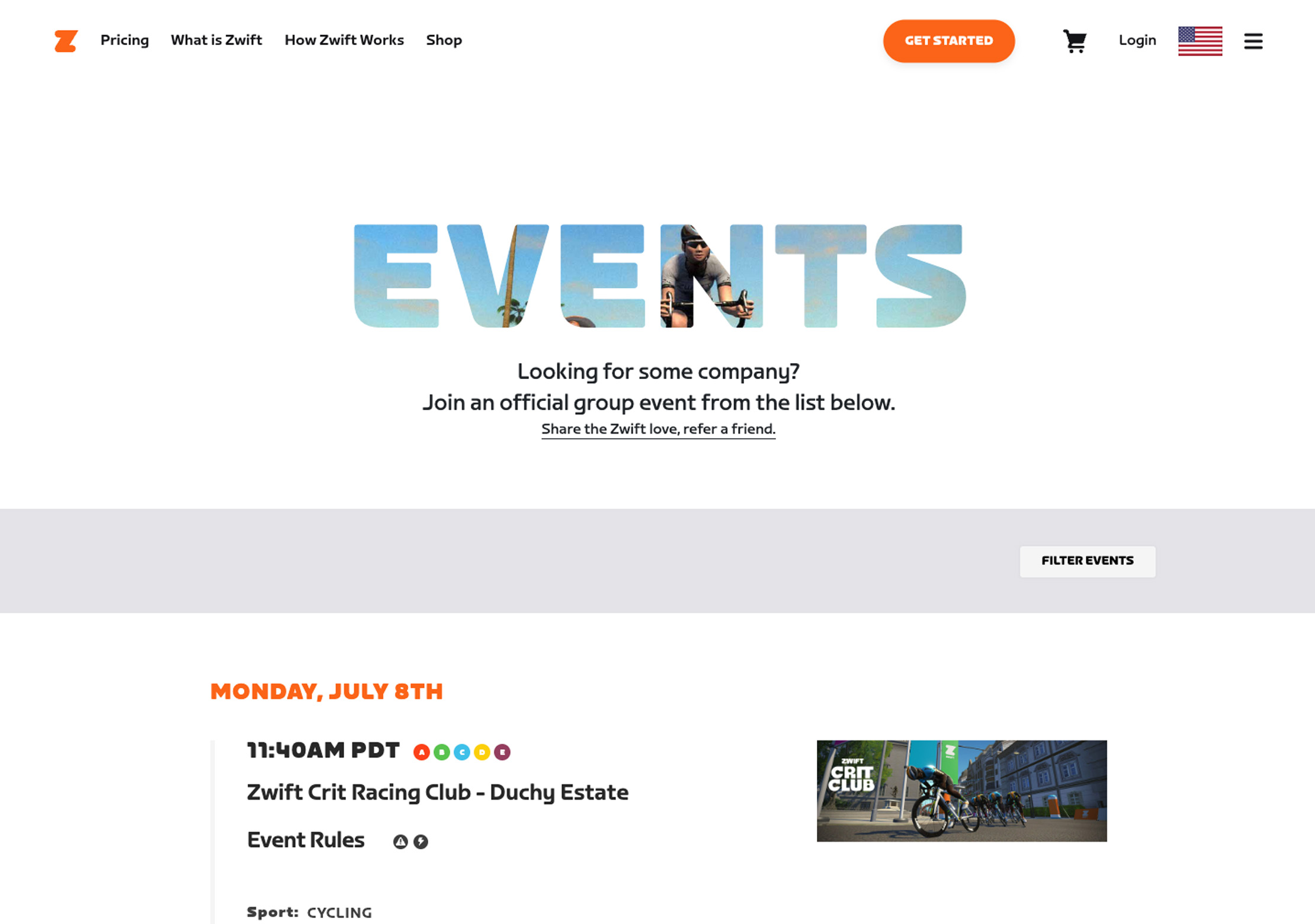
Once the filter options had been finalized we then reviewed the current design and the tech stack that it lived in so that we could determine what would be the level of effort from both design and development. We know that we wanted it to live on the main tech stack so that we could have the best experience possible given our limitations. We found that we wanted to utilize the space a bit better since the old version of the page had a rather large useless header that pushed content further down the page. The filter bar did not present itself enough and felt like more of an afterthought. The event cards also lacked some design love aesthetically but also functionally. They didn't utilize the space in an efficient manner and also did not present the right information based on the event type.
Side by side comparison of current and redesign.
As we applied some refinement to the layout of the page we also created a prototype to validate the design decisions made during visual exploration. We took the opportunity to utilize components on other pages, like some updated event cards, and a carousel that could be used to promote top tier events or features. In keeping with the Zwift design principles we added some moments of delight when searching, the hero banner cycling through the featured events and cycling through the carousel collections.
Animated examples of the different components used in the experience.